It seems like every designer out there has an opinion about the Comic Sans font, and it seems the overwhelming majority of those opinions are negative. How has a single font become the focus of so much ire? And what, exactly, is behind all the hate?

A Brief History of Comic Sans
Comic Sans was created by Vincent Connare in 1994 for Microsoft. It was originally designed to be used with Microsoft Bob, but it was completed too late to be included in the program.
The font was based on lettering from comic books Connare had in his office, specifically Watchmen (lettered by Dave Gibbons) and The Dark Knight Returns (lettered by John Costanza).
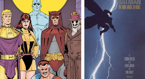 On the left: Watchmen characters. On the right: The Dark Knight Returns cover
According to statements from Connare, he never intended the font to be released for general use, and only designed it to be used in comic-book-style speech bubbles within MS Bob.
 Vincent Connare presenting in 2008.
The Life of Comic Sans in Microsoft Applications
The font ended up being included in Microsoft 3D Movie Maker, which used it in its pop-up windows and help sections. Later it was included with Windows 95 Plus! Pack and then became a standard font for the OEM version of Windows 95. Eventually it was included as a default font for Microsoft Publisher and Internet Explorer.
Some Well-Known Uses of Comic Sans
Comic Sans has been used on a number of well-known products. Beanie Babies have used the font on their tags since the late 1990′s. The 2004 Canada Day 25-cent collector coin also used the font. The Sims video game uses it as well.
The Origin of the Comic Sans Hate
One of the main reasons Comic Sans became the target of such hatred was its widespread usage, particularly when dealing with serious or formal subjects.
While Comic Sans was perfectly adequate in designs for children or designs related to comic books or cartoons, it had no place in business or professional work usage. It’s also ill-suited in content body text – it’s best used as a headline/heading font or short quote (such as in a comic book). But nevertheless, Comic Sans has cropped up all over the place.
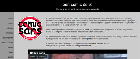
The "Ban Comic Sans" Movement
The "Ban Comic Sans" movement started in 1999. It was reportedly started by Dave and Holly Crumbs, graphic designers from Indianapolis, after an employer insisted they use Comic Sans in a children’s museum exhibit.
While the group is a bit tongue-in-cheek, they do point out one of the biggest problems in amateur graphic design: disregard for appropriate typography choices. Where a professional designer will (usually) consider the impact their font and typography choices have on the overall tone of a project, an amateur will often just pick a font they like, disregarding the font’s impact on the final design.
Inappropriate Uses of Comic Sans
The single biggest complaint against Comic Sans is that Comic Sans portrays a very definite tone and feeling when it’s used; mainly, an immature, informal, childish mood.
A recent Flickr discussion in the Ban Comic Sans group talked about inappropriate uses in the wild.
Some of the uses shared were:
- Sign for swimming pool rules at a summer camp
- A grave marker
- Writing on a commemorative bench
- Sign for a bone marrow transplanet clinic
- Government job applications
- Teacher reviews for an art/graphic design department
A Showcase of Improper Usage of Comic Sans
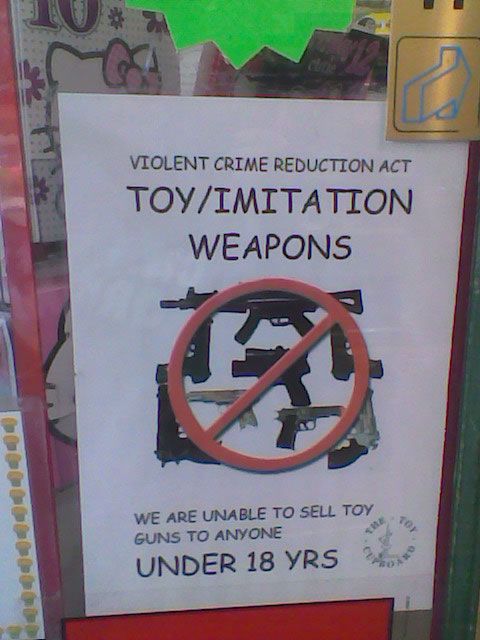
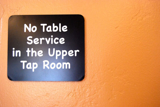
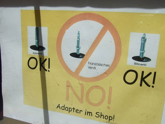
Here are real-world examples of when you shouldn’t use Comic Sans.
By ocacsms
By Justin Henry
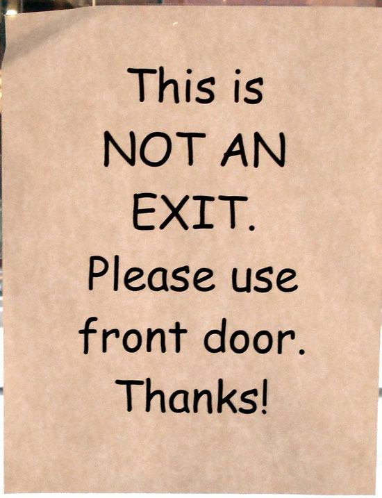
By Tom Magliery
By Liz Hall
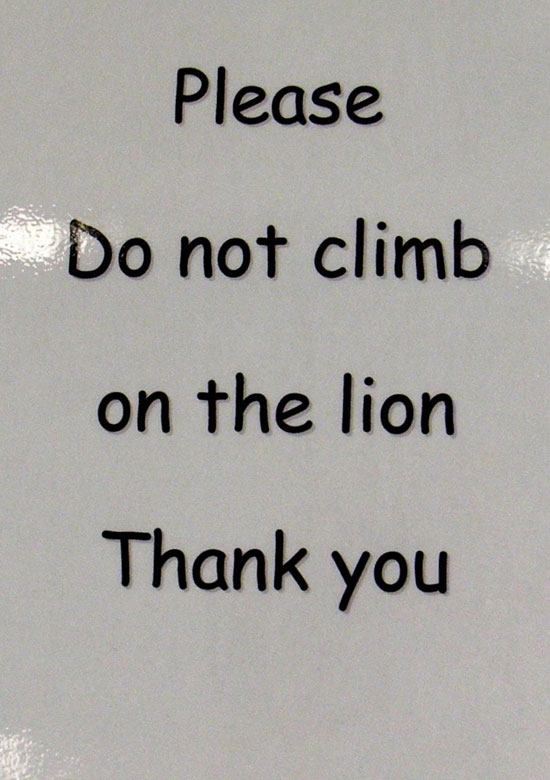
By Marc Moss
By Marc Moss
By Raltaran
Technical and Aesthetic Drawbacks
While many who hate Comic Sans do so just because of its omnipresence, others hate it because of aesthetic and technical drawbacks. Both the kerning and weighting of the font are inconsistent, leading to a haphazard appearance in large swathes of text (or even small ones).
Todd Klein did an analysis of why Comic Sans isn’t even appropriate for comic books in his post, "Comic Sans Font Examined". It’s an interesting read, and points out some further shortcomings of the font.
Some Alternatives to Comic Sans
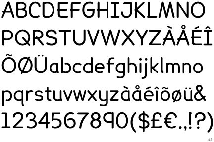
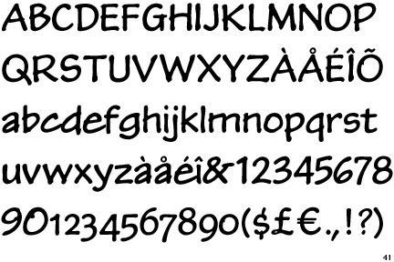
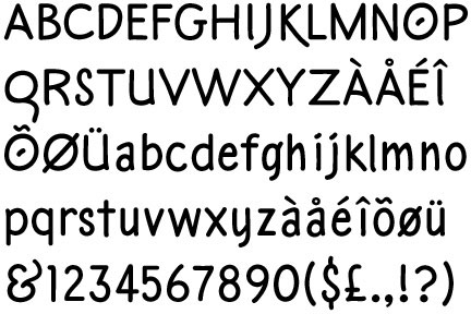
If you’re looking for a font that gives the same impression and feeling as Comic Sans but doesn’t come with all the negativity, give the following fonts a try.
Lexia Readable
P22 Kaz Pro
JM Doodle Medium
FF Friday Regular
Sharktooth Regular
Comic Strip
Ban Comic Sans has a list of Comic Sans alternatives available on their website.
Additional Resources about the Comic Sans Controversy
- Ban Comic Sans: An article by Dr. Christopher Scanlong on the font.
- Most Inappropriate Use of a Typeface: A thread on Typophile that includes multiple references to Comic Sans.
- Comic Sans: A profile of the font from Typophile.
- Not Funny: Fighting the Good Fight Against a Very Bad Font: An opinion piece by Mike Miliard on The Boston Phoenix site.
- The History of Comic Sans at ROFLThing NYC: A video history.
- Comic Sans, the Font of the Gods: A piece from Coding Horror.
Image Sources:
Related Content
- 25 High Quality Free Fonts for Professional Designs
- 45 Beautiful Free Fonts for Modern Design Trends
- 20 Creative and Unique Typefaces
- Related categories: Graphic Design and Resources




No comments:
Post a Comment
Note: Only a member of this blog may post a comment.